...I actually starting making header graphics. :) And of course, what else would I start with but a Buffy one?
Version 2. The Good, The Bad, & The Ugly

...I actually starting making header graphics. :) And of course, what else would I start with but a Buffy one?
Version 3. Thanks, That Was Fun

This graphic included an image from each of the seven season finale episodes of Buffy to commemorate the show's final year. Sniff.
Version 4. The Journey Continues

Ah yes, my other huge small and insignificant obsession. :) A bit of a boring header, really, but I really liked these promo shots and wanted to use them.
Version 5. Merry Madness

A rather silly layout I put up for the holiday season in December, 2003. I think I made it when I got bored studying for exams. Heh. Whoops. Anyway, as the title implies, it featured
Merry Brandybuck from The Lord of the Rings.
Version 6. The Scottish Hobbit

Meh, not my favorite title in the world, but it serves its purpose. :) I liked this one at the time because it was the first one I really experimented with graphically, trying out some different techniques (not many, though, mind you). It featured Pippin Took from The Lord of the Rings, and also marked the first time I tried changing
the blog's color scheme (had some help from an artistically-inclined friend for that...thankfully, since the color I chose myself was rather abysmal. Lol). February, 2004.
Version 7. Angel through the years

Fairly self-explanatory. This one features the official cast photos from each of Angel's 5 seasons. March, 2004.
Version 8. Spring Forward

I finally decided that I wanted to have a layout that wasn't TV or movie-related, and so I made this one at the beginning of Spring. I like the way it turned out. :)
Version 9. the whale rider

I watched Whale Rider in July, 2004, and was immediately enchanted by it. So, since Spring was over and my blog was begging for a change, I made this one. Just nice and simple.
Version 1.10. LOTR - Dream

The first layout to commemorate the blog's new name: Verbatim et literatim, which means "word for word and letter for letter". LOTR rocks. Fonts used: X-Files, Annifont, Century Gothic, Tengwar Sindarin-1
Version 2.11. Fall Backward

This layout used a beautiful image of the red maple trees at the Imperial Palace in Kyoto, Japan. V. pretty. Fonts used: CAC Champagne, Univers
Version 3.12. Renaissance Man

2004/12/19 - This one uses three of Viggo Mortensen's beautiful paintings: Elendil, Gulf Stream and After Darkly Noon. Fiddling around with the graphics in PSP8, I discovered the wonderful, useful new feature known as Seamless Tiling, and the rest is history. :) Fonts used: X-Files, Arial Unicode MS
Version 4.13. What Do You See?

2005/03/09 - Made on the day following the media release of the new book covers for Harry Potter and the Half-Blood Prince (book 6), I was happy to have new pictures to use in my layout. Wonder who the half-blood prince is? And is that a pensieve or not? Fonts used: Harry P, Arial
Version 5.14. Mars girl from Neptune

2005/08/27 - What better way to not study than to make a new Veronica Mars header? The show only started airing here in Canada during the summer, so I'm a relatively new fan, still getting through the first season episodes. I have the sinking suspicion that this is gonna become one of my many obsessions... :P Fonts used: Georgia
Version 6.15. Paranoid Times

2006/05/16 - Just before leaving on a trip to Ottawa to finally see an Our Lady Peace show on a bonafide concert tour, I got my act together and put up this new layout. It involves layers of three images from OLP's November 2005 concert at Toronto's Massey Hall -- the Hall itself, the band performing, and the song setlist. My only question is this: if you're Healthy in Paranoid Times, does that mean you're paranoid or you aren't paranoid? Fonts used: Anarchy, 18thCentury
Version 7.16. Equal/Opposite

2007/04/01 - You know the drill: new Harry Potter book covers, new layout. :) Fonts used: Parseltongue, 7 Days
Version 8.17. Tricks

2008/05/31 - After having Deathly Hallows up for the past 13 months, I figured it was high time to change it up a bit. What better than The Dark Knight, a movie I'm really looking forward to? I hope it won't disappoint... Fonts used: Base 02, Misproject
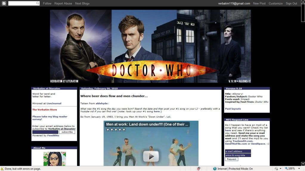
Version 9.18. Allons-y!

2010/01/12 - Clearly left the previous layout up too long; been neglecting to maintain Verbatim as well as I should. This layout is a tribute to one of my recent new favourites, Doctor Who, and features the three Doctors from the 2005 series to date: Christopher Eccleston, David Tennant, and Matt Smith. I hope the era of the 11th Doctor is as good as those of the 9th and 10th Doctors... Fonts used: Impact